
4 December 2013:
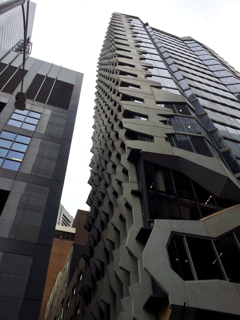
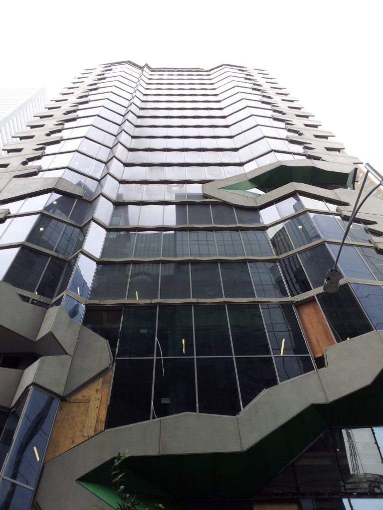
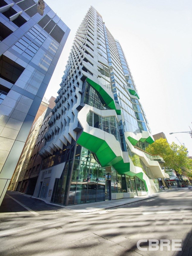
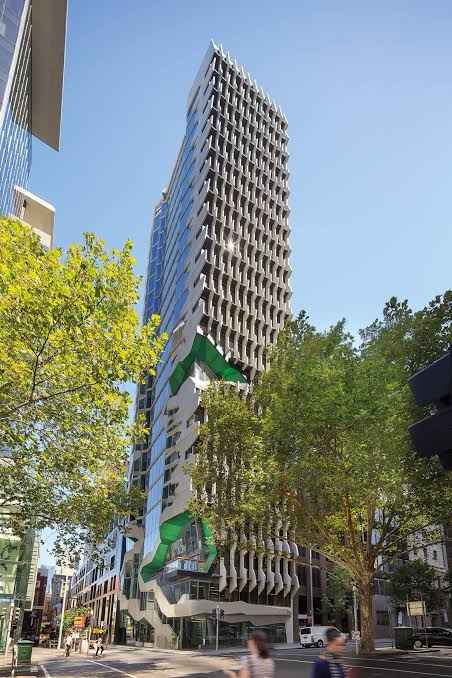
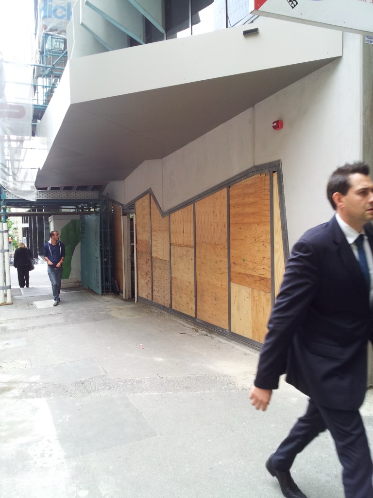
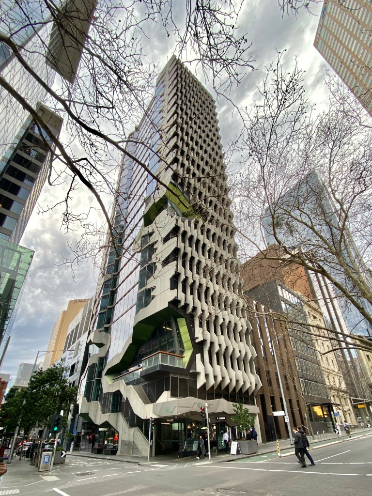
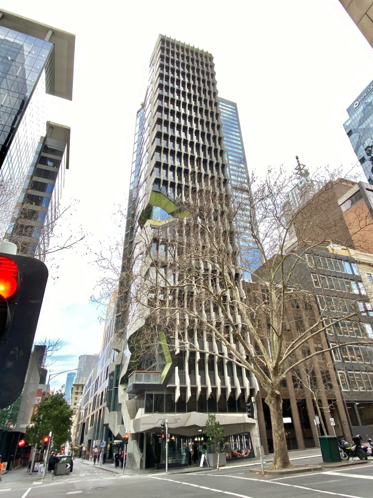
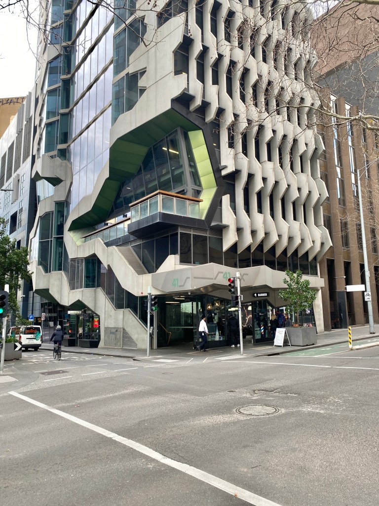
New #architects Institute of Architecture HQ #exhibitionstreet, or rather the back facing the #lane, by @lyonsarchitecture. Looks aggressive from this angle, and looking up it feels like a set of hacksaw blades. I don’t hate it though. The front is the same, but trees and scaffolding. Update : can’t find any explanation of the zigzags except maybe it was meant to make it look rough and solid from angled views, and so the ‘cutouts’ at the lower level look deeper than they are ? Lots of words about how they squeezed a tall building onto a small site however. Hmm just like all those too sheer apartment buildings from the period, now generally disallowed without setbacks, though you can go to 80m on corners, so maybe this would comply. I havnt been in, think it was meant to draw people in and up, all I know is that the Architext bookshop closed in 2016. Pics 4, 5 not mine.


2023

Main practical impact for tenants working within the narrow footprint is that the toilet cubicles adjoining lifts open directly on to working areas.
No vestibules or other transition zones, which made for interesting noises and odours at times.
LikeLiked by 1 person