
2 December 2025
I thought the spaces underground at the new Town Hall Station might be vast, and they are !
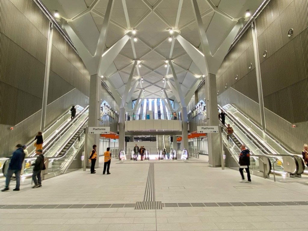
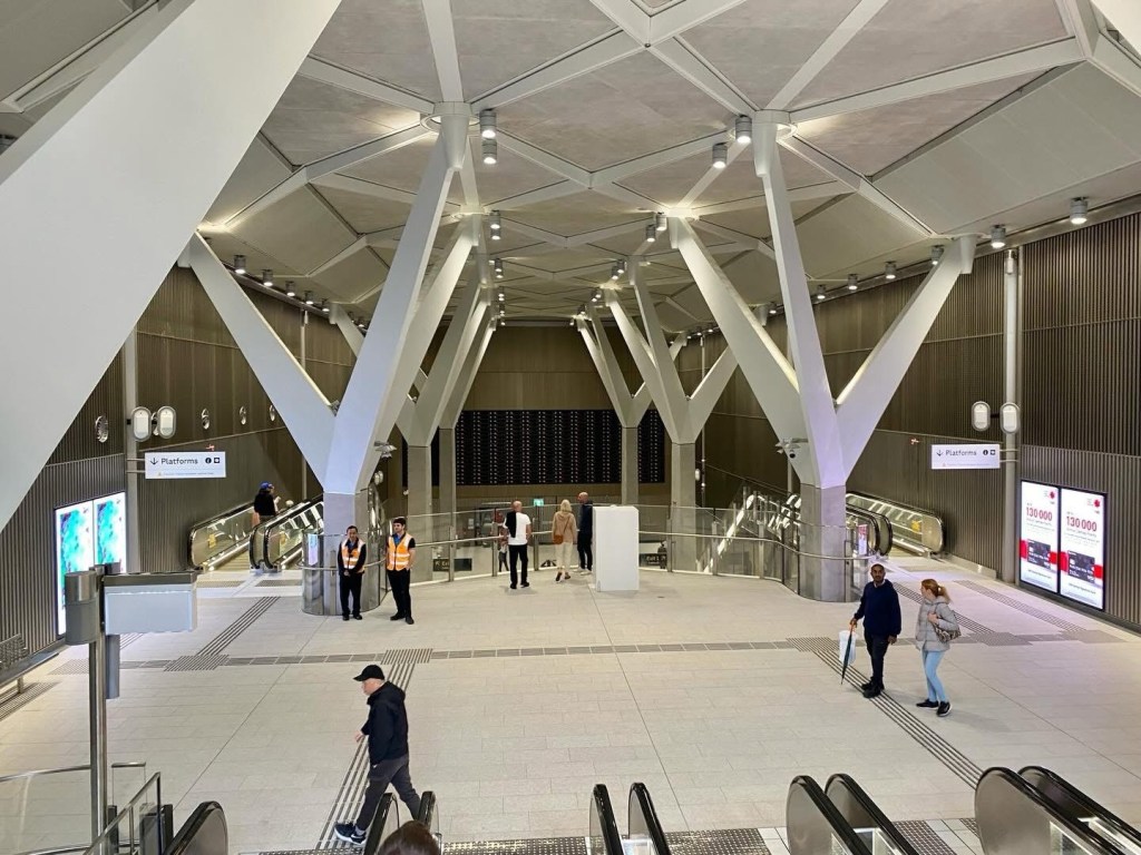
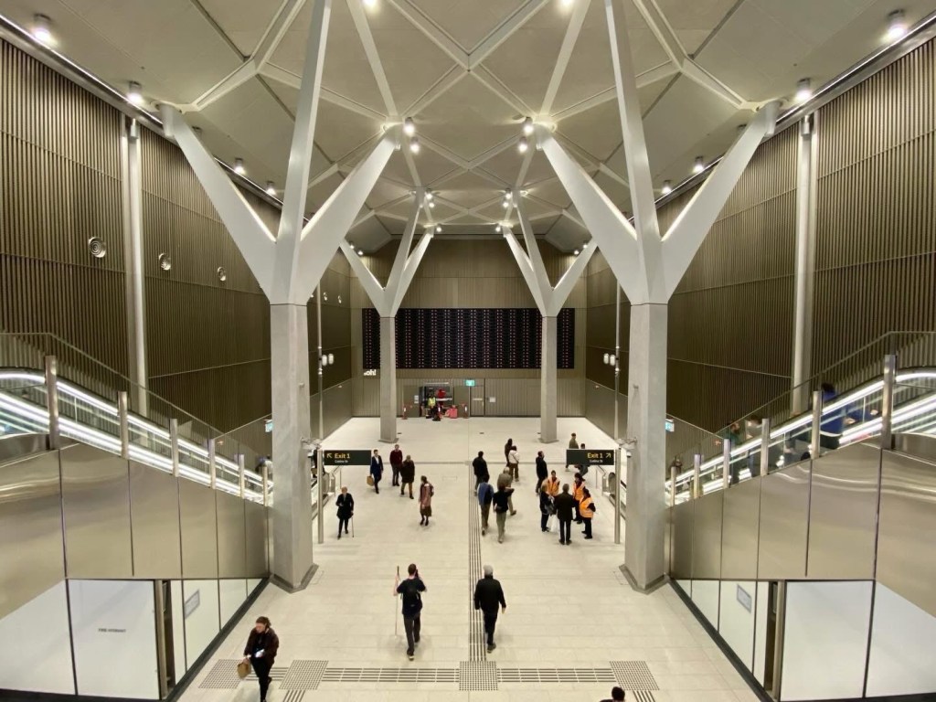
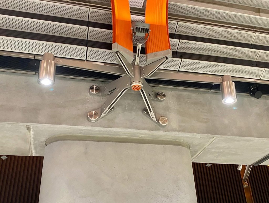
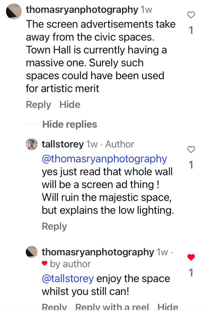
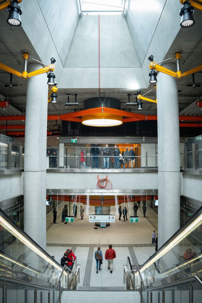
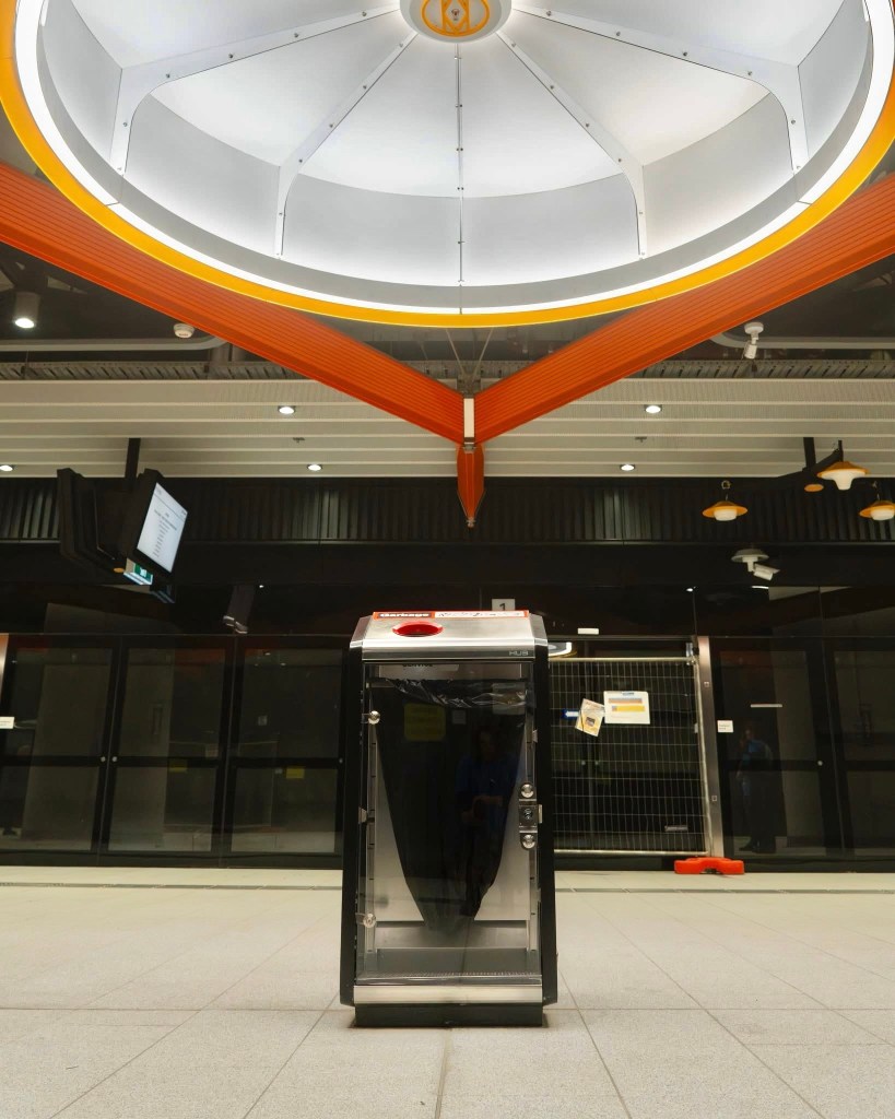
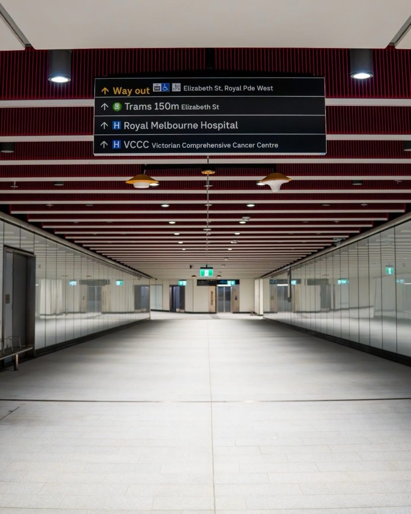
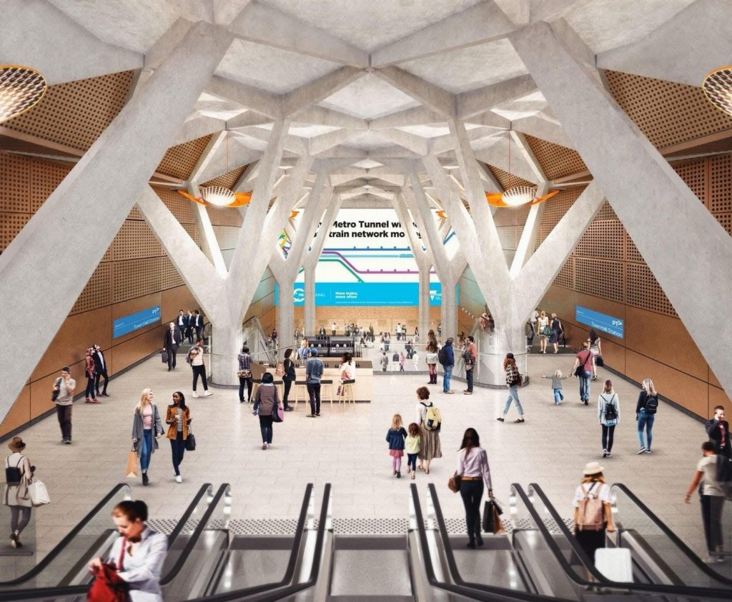
Firstly there’s the cavern under the city square, with those forked beams, very grand, but strangely all one colour and relatively low lighting (update: the end wall will be one horrible giant ad screen !).
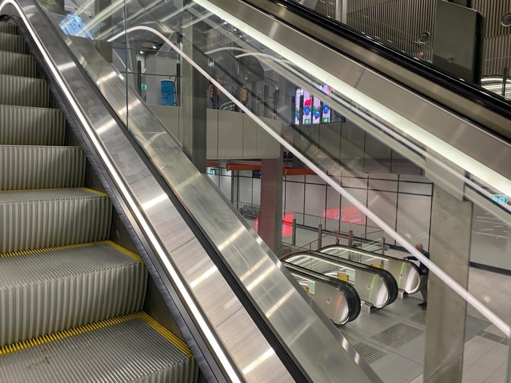
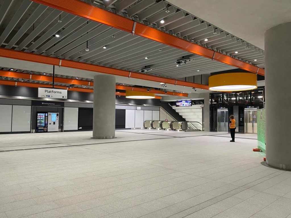
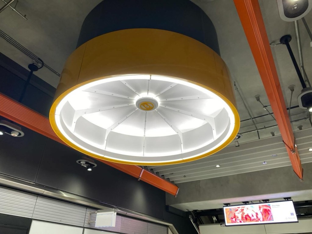
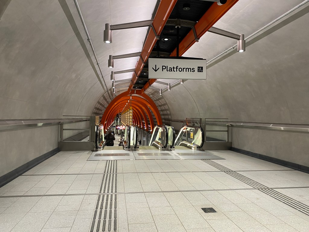
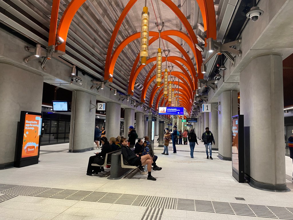
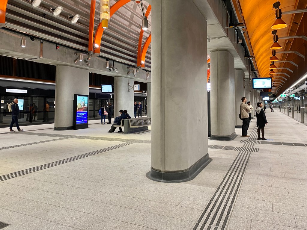
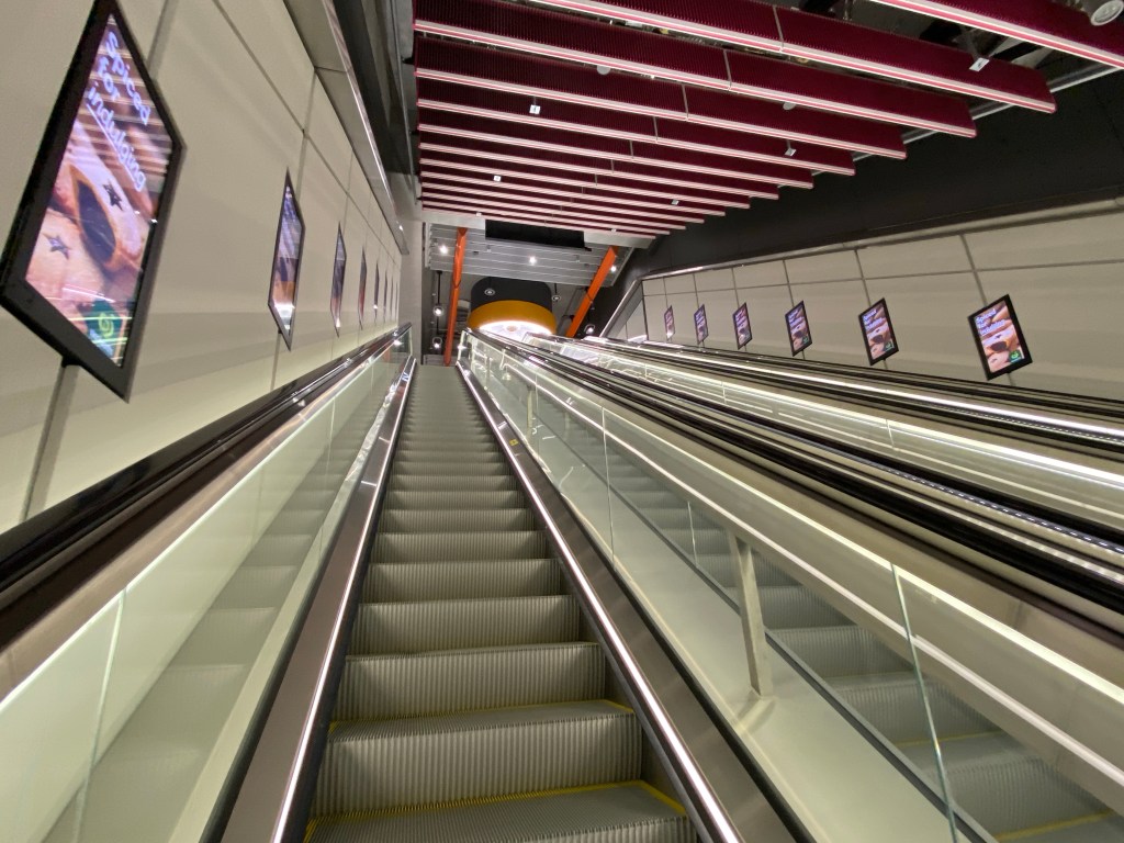
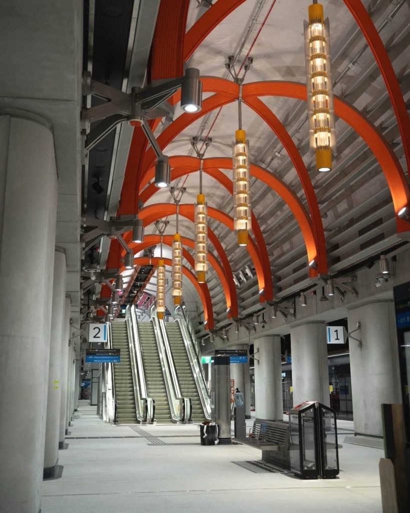
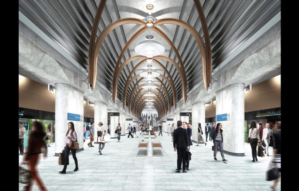
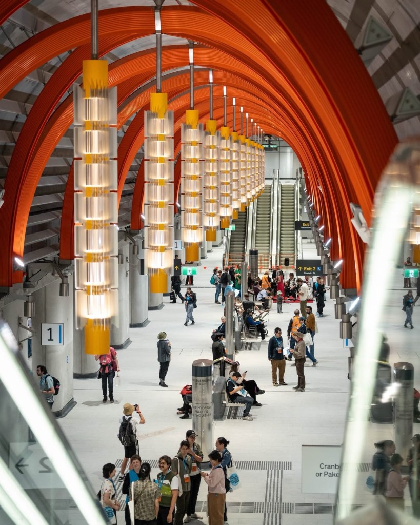
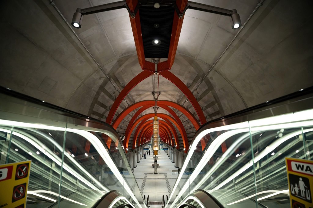
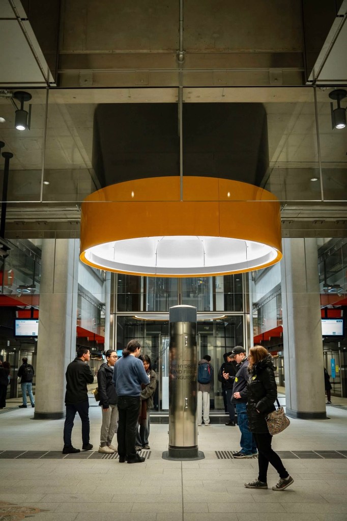
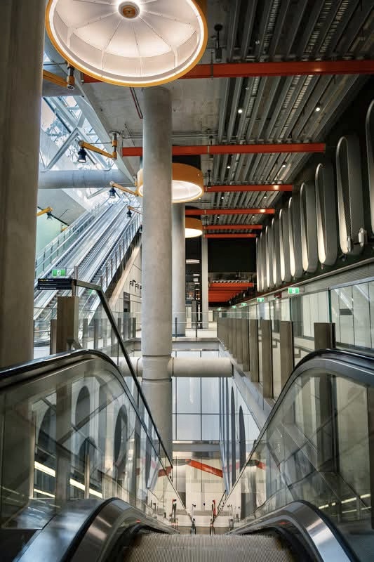
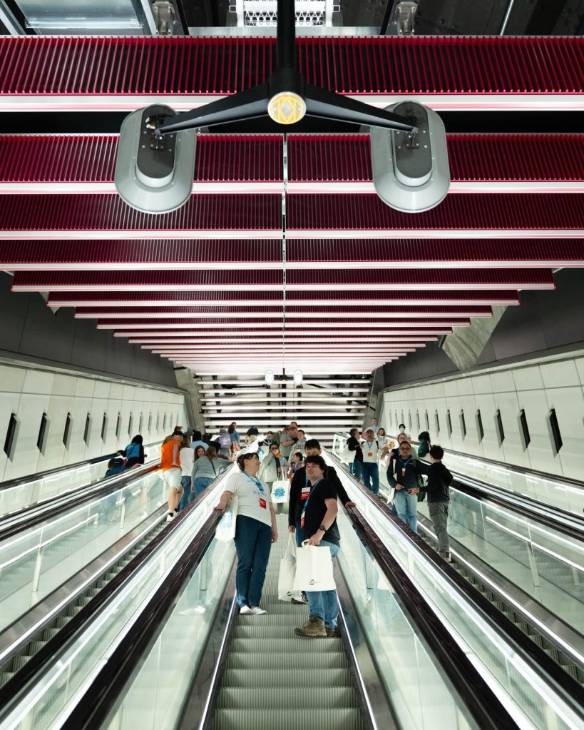
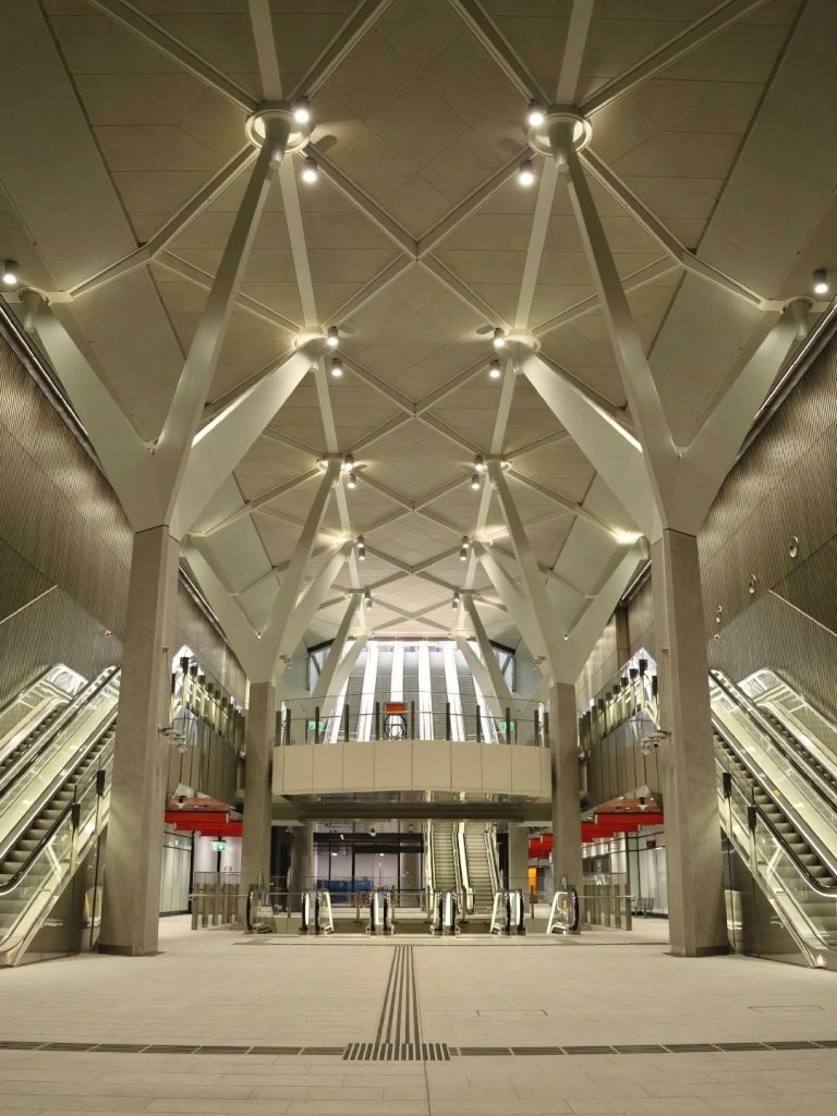
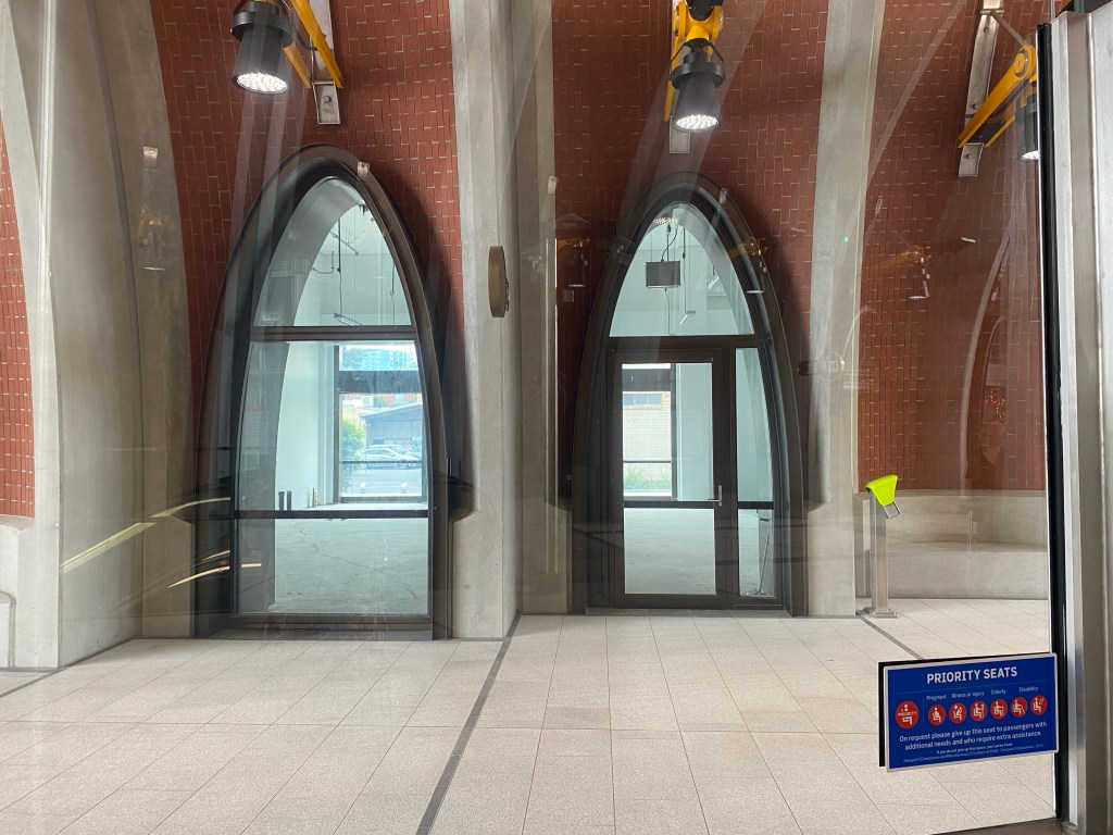
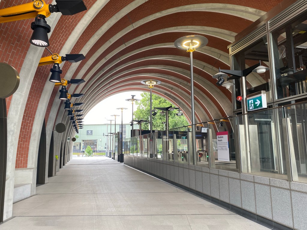
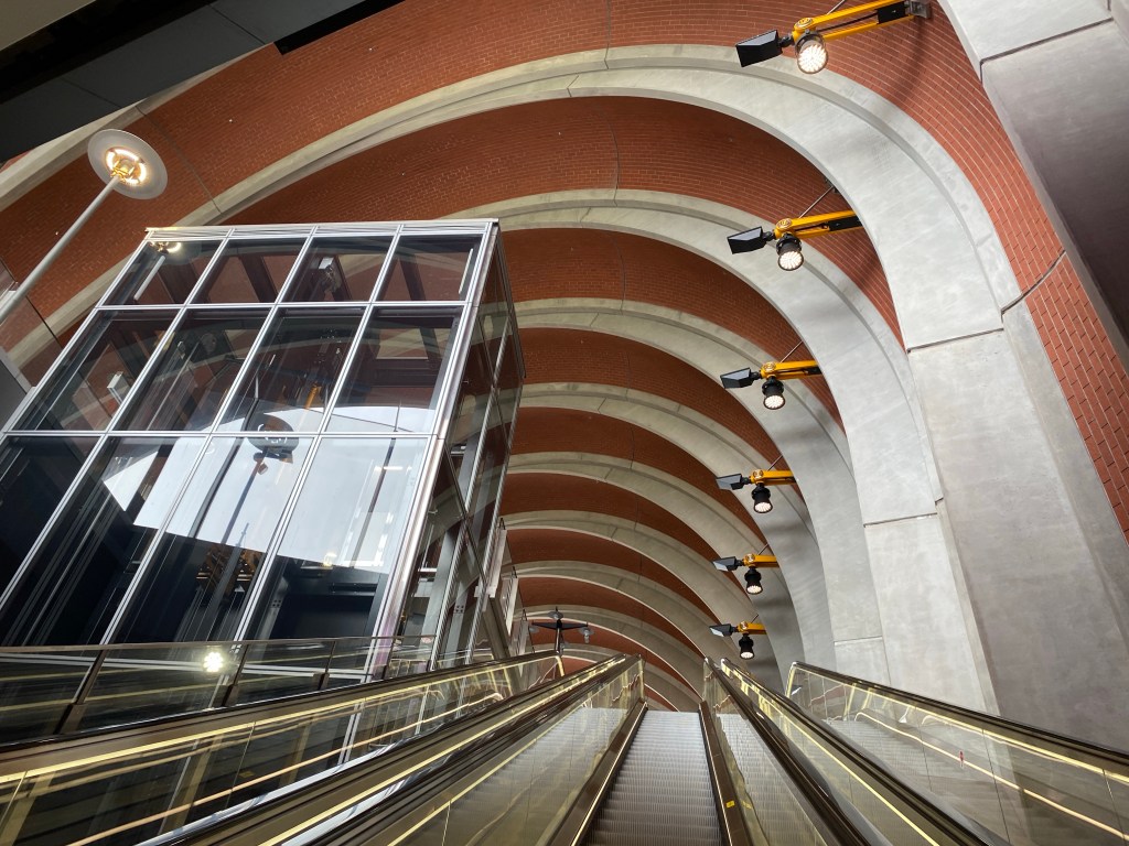
You go down in two stages, then another one, into more wide spaces, then across and down to the platforms, which are quite spectacular. Very wide and very tall, I do like the orange arches and chandelier things, it would be all just grey without them. They’ve got fun but not very visible star shaped steel supports.
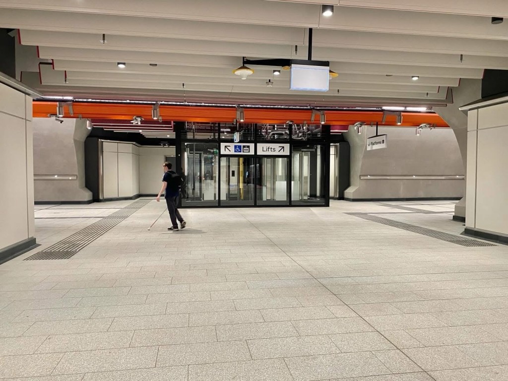
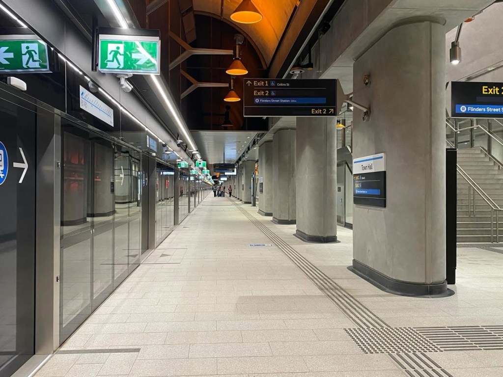
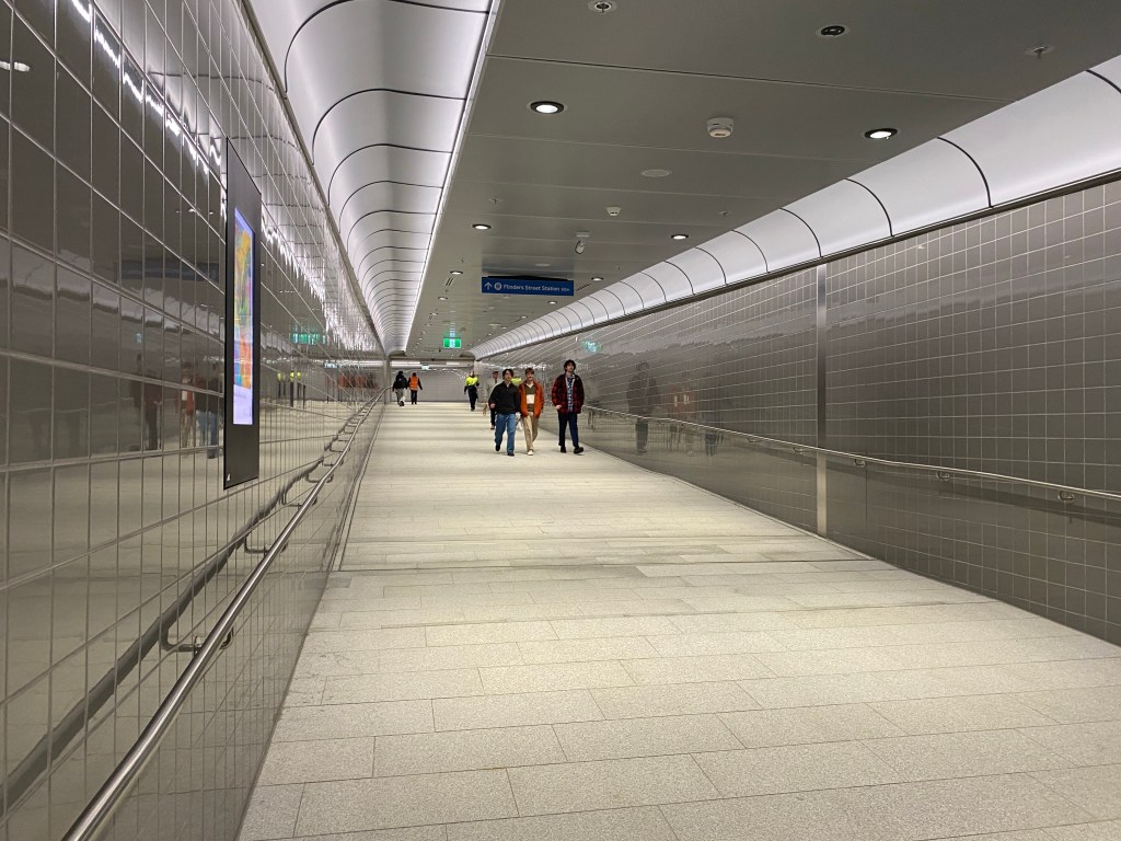
The platforms are 240m long – hmm a quarter of a kilometre! For future 10 car trains, once the rest of the stations are lengthened ? Anyway they’ve got sort of orange uplights to the arched roof. I thought perhaps that there’s be a direct walkway from Collins street to Flinders street station, but no they’re separate entrances to different ends of the platforms.
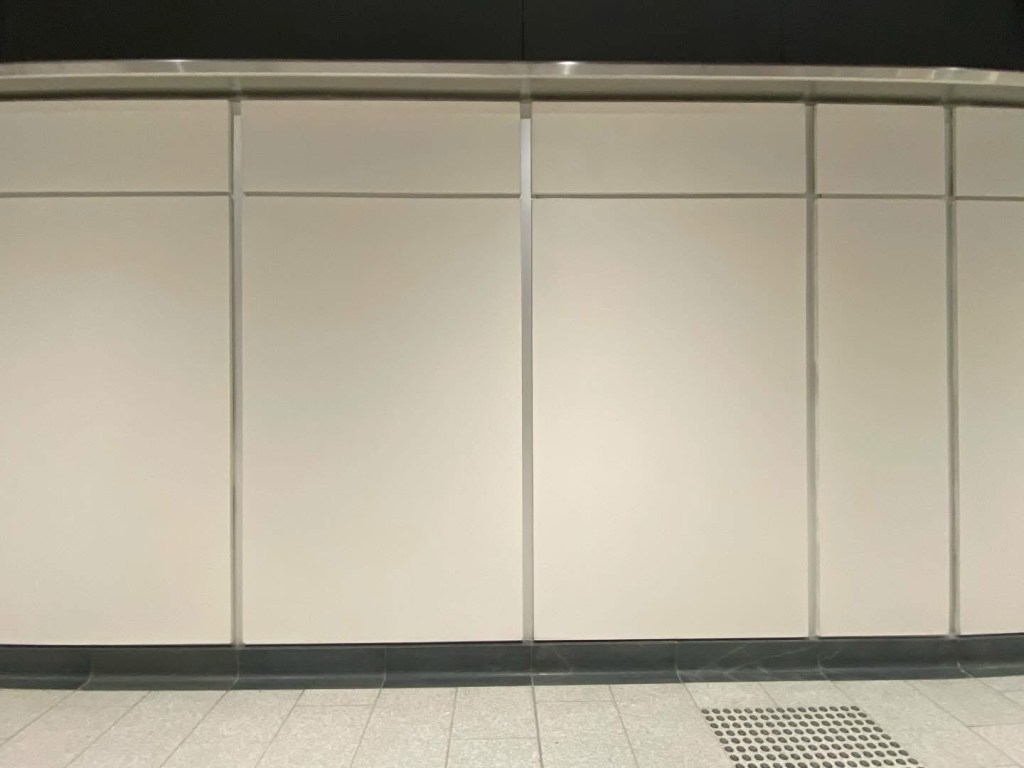
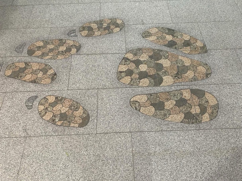
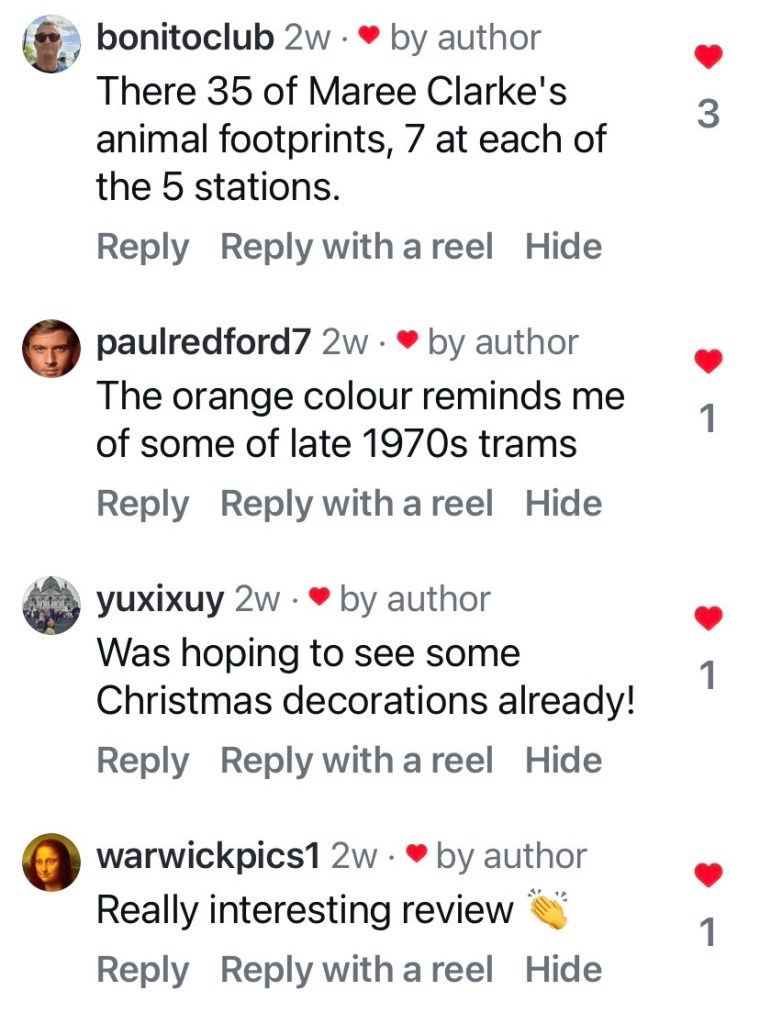
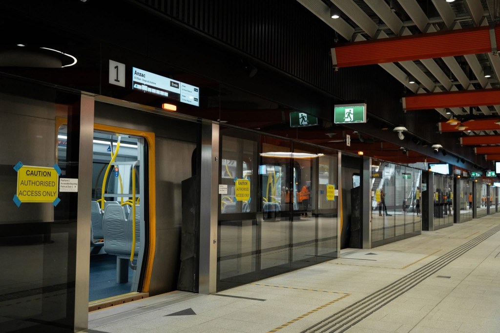
There’s quite a mix of materials everywhere, mostly grey or white, so it hangs together, but I do wonder why ? To avoid monotony? There’s panels of while and grey glass, shadow lines and expressed framing, smooth concrete which must be a render, and soft white stuff panels too, both of which I assume will mark ? Maybe can be cleaned easily ? And lots of shiny stainless steel, and grey painted steel too (or it’s possibly cast aluminium), in fact the cavern forks are steel not concrete. There’s less of the orange and yellow than I was expecting. And there’s cute art by @ree_clarke of native animal footprints in the platform paving.
So I’m impressed but I do think the finishes could have been more consistent. Architects for the project were the British based @rshparchitects and @wwparchitects, with locals @hassell_studio.
November 2025
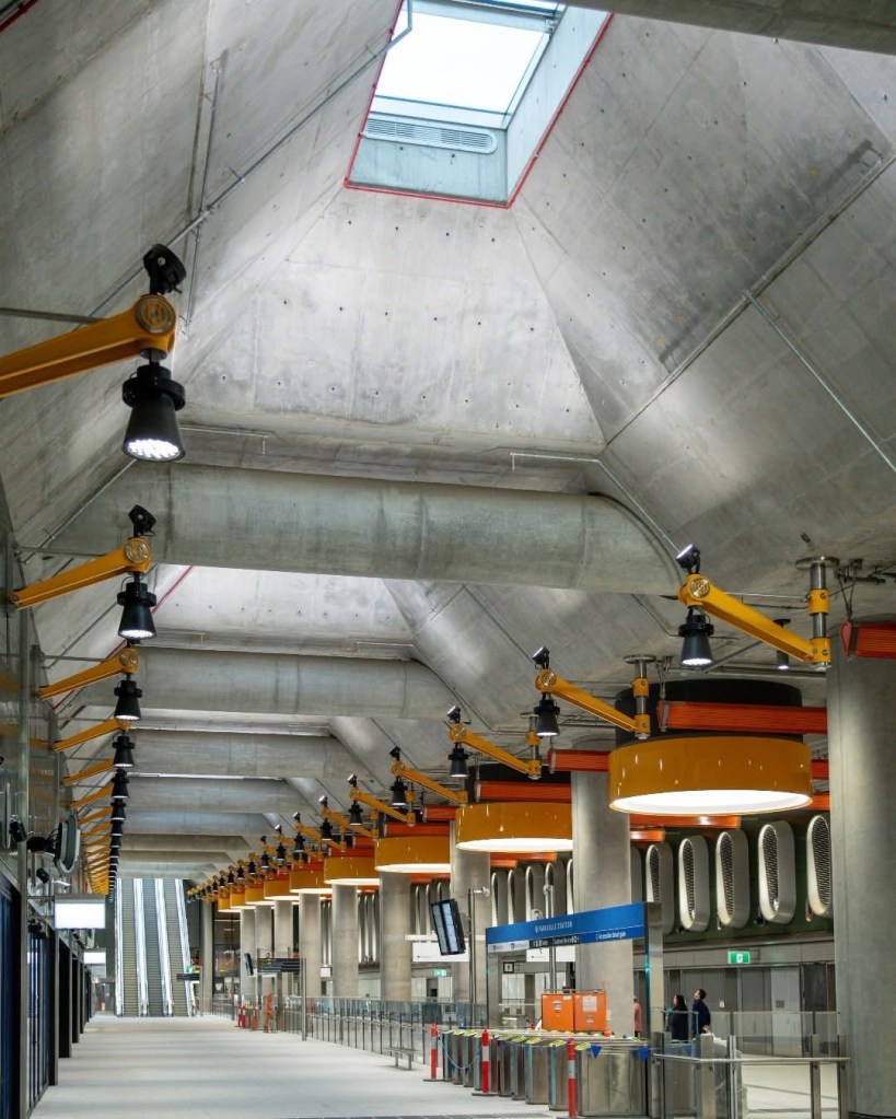
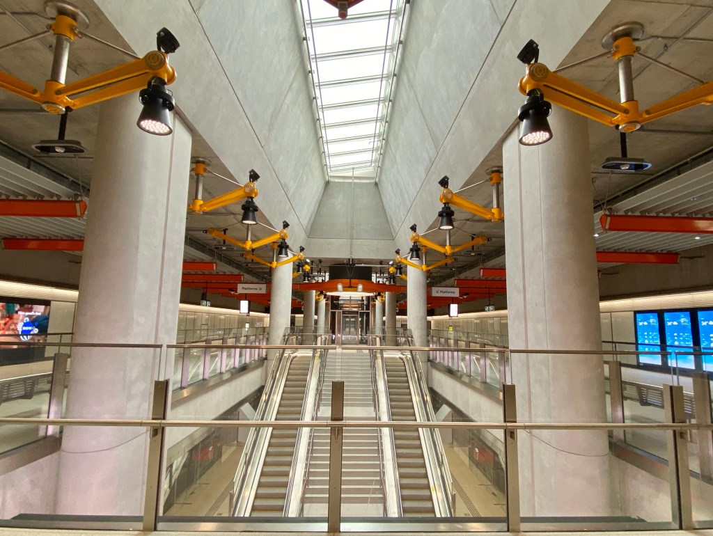
The Metro Tunnel is going to open for limited service soon, so I thought I’d see what I could make of the design underground – seems it’s all similar, bare smooth concrete walls and roofs, with lots of brightly coloured lamps, brackets and battens. The lead designer Ivan Harbour, from the international @rshparchitects, and Melbourne architect Ingrid Bakker, of @hassell_studio, said the yellow, red and pink is drawn from Melbourne sunrise/sunsets, a cheery idea though not particularly Melbourne.
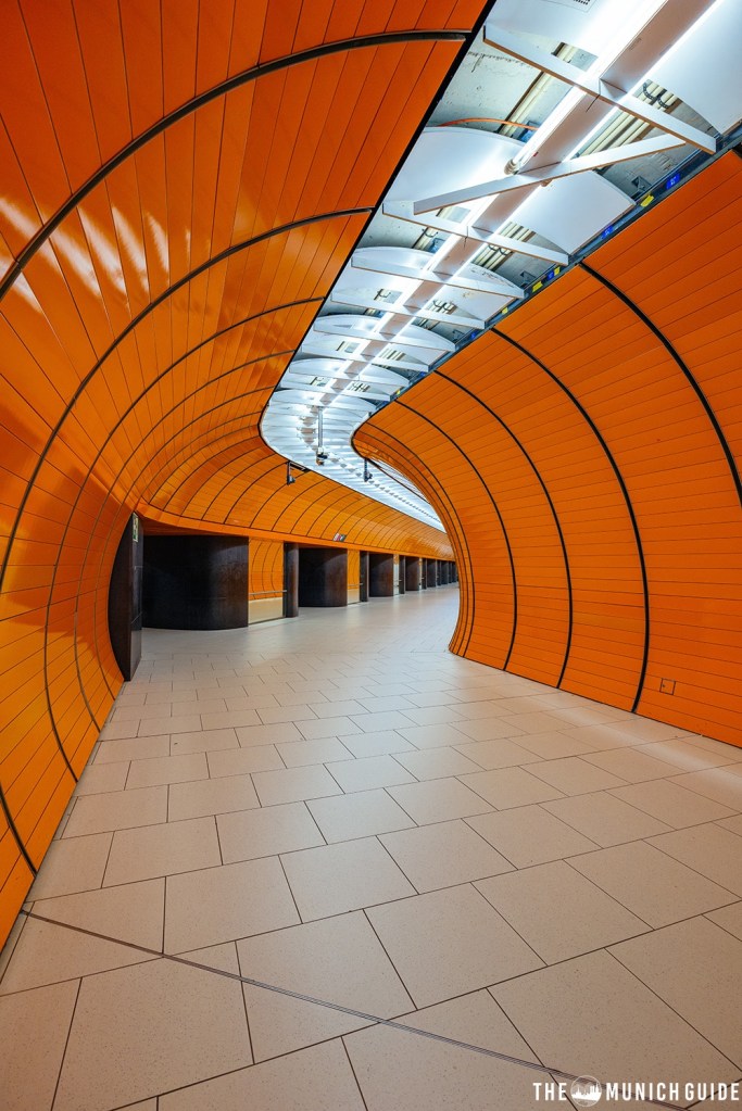
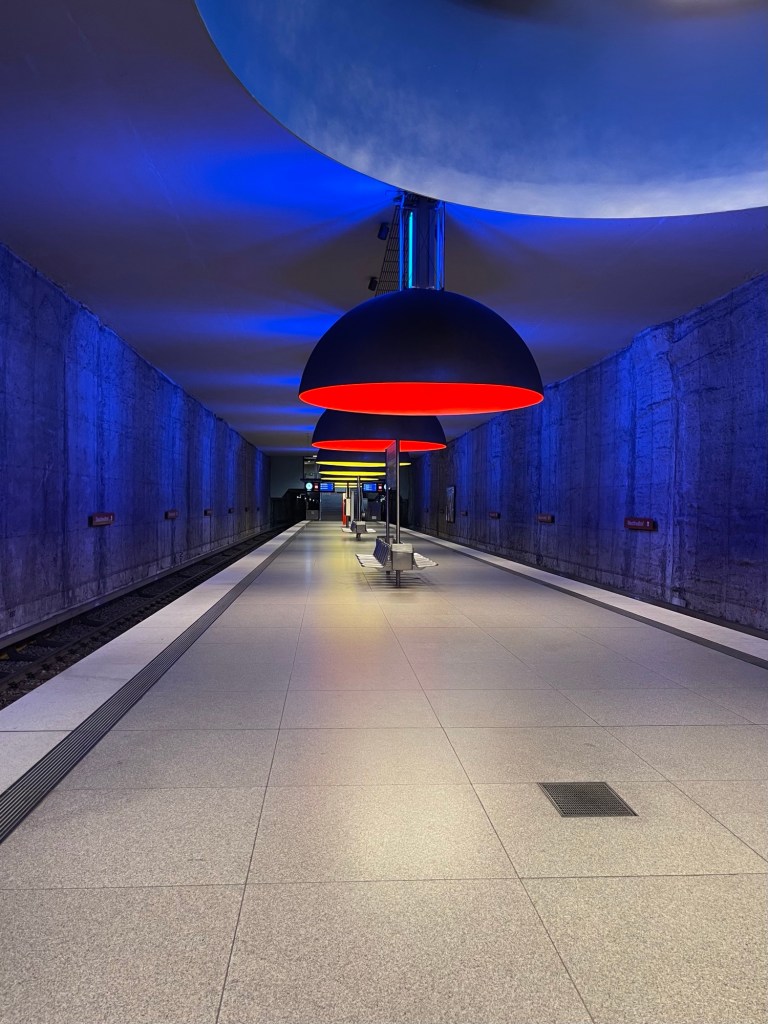
In fact it all reminds me of the Munich Ubahn, the orange of the 1971 stations and the moody huge hanging lamps of a 1998 station, altogether it’s sort of 70s Brutalist and 70s High Tech mashed together (and I predict the lower parts of the concrete walls will get marked pretty quick).
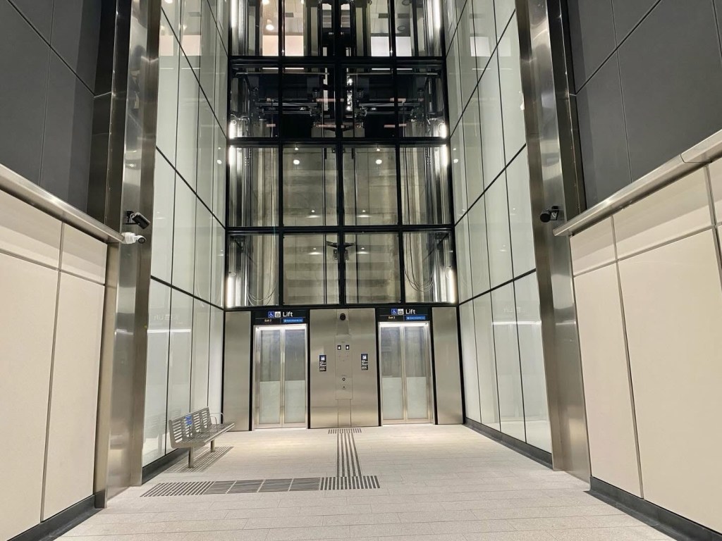
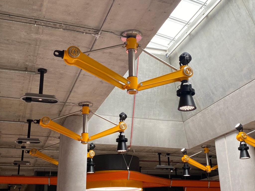
From the photos it’s also rather busy, with some elements in stainless steel or grey and other signage in different colours, but it is large down there, maybe I’ll like it more in person.
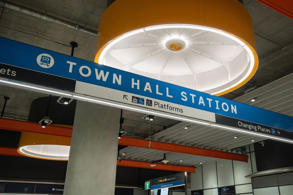
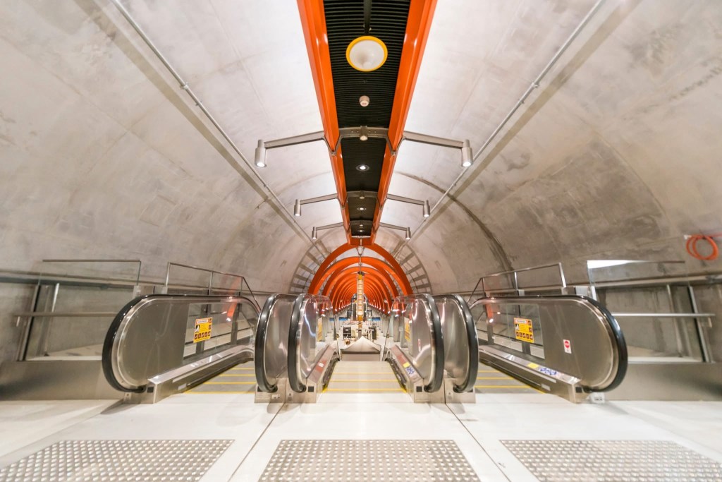
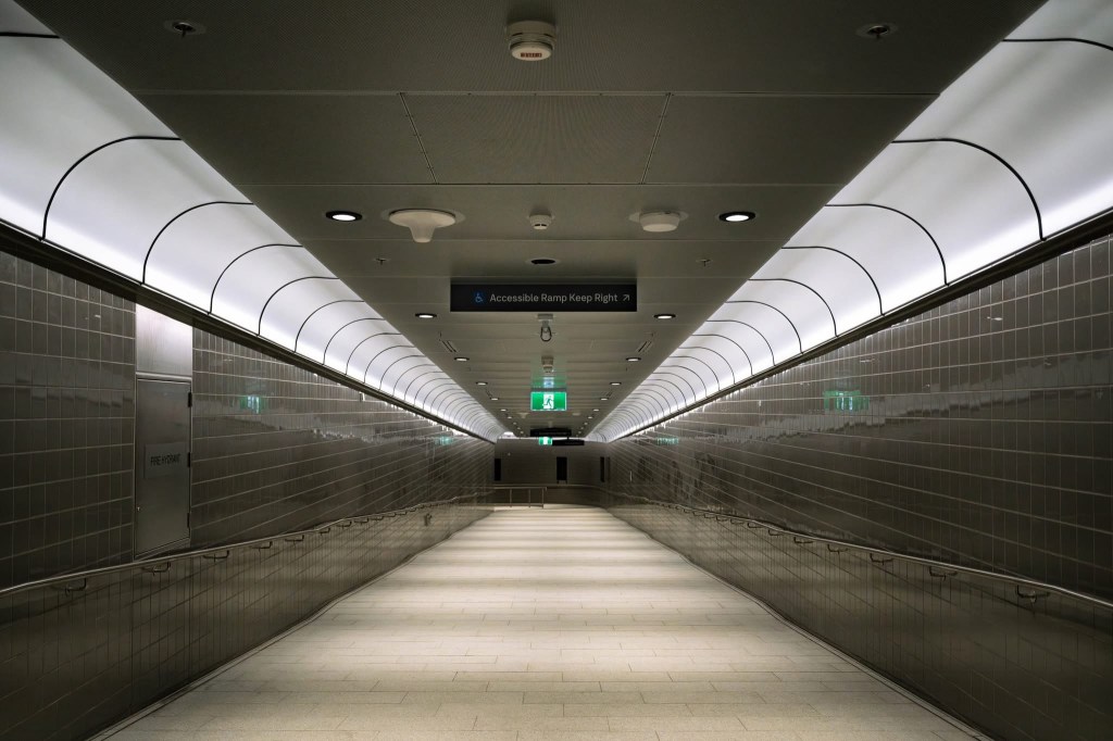
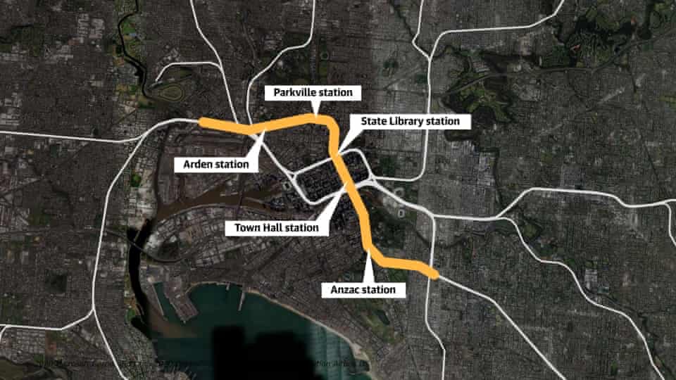
Town Hall and State Library have arched roofs at platform level while the others are flat bit open up to skylit areas (I think). Otherwise they’re all the same, I like the idea of being able tell which station you’re train is coming to, but then with the platform doors you’ll be relying on in-train announcements? There’s some pretty ordinary looking tunnels too, and the battens at the escalators and entrances are white on the way in and purple on the way out in case you don’t know whether you’re coming or going 😊
The huge cavern under the City Square looks pretty amazing, though uplighting would have been better I think.

December 2025
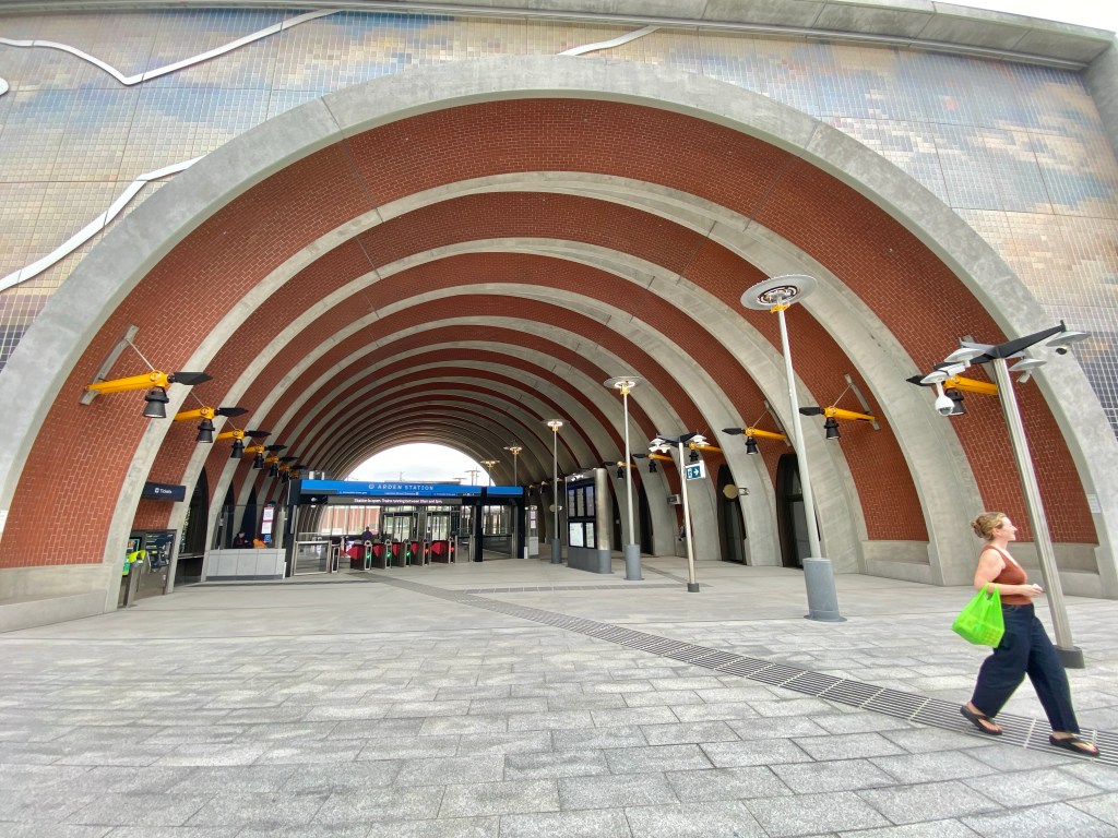
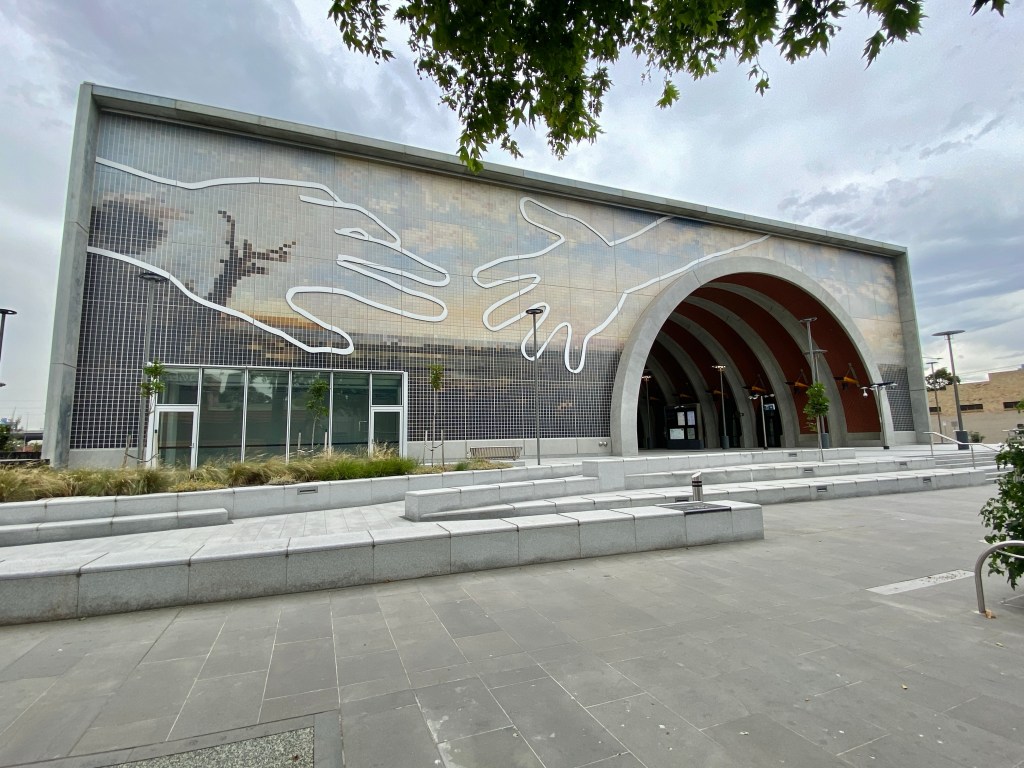
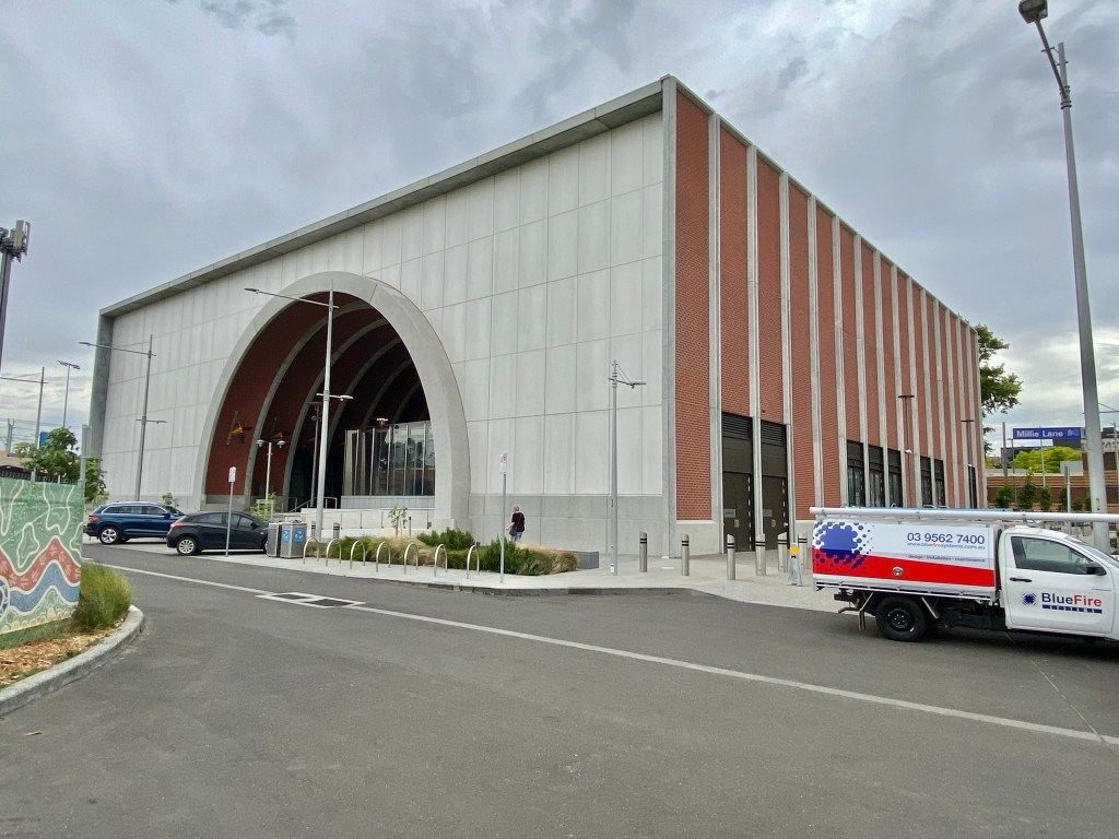
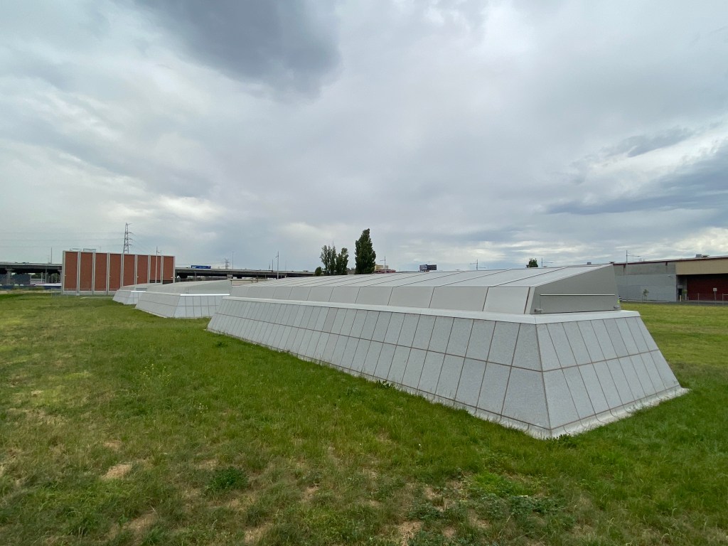
Arden Station above ground is quite wonderful. Where other stations have canopies, here they’ve gone for a solid box, with an arched brick lined space cutting through. It’s at an angle, and the arches are in individual coved sections, stepping sideways, which creates a fine effect. And the side openings are cute little parabolic (or catenary?) arches, a little bit Gaudi. The bricks are I think actually tiles, but tiles are nice too.
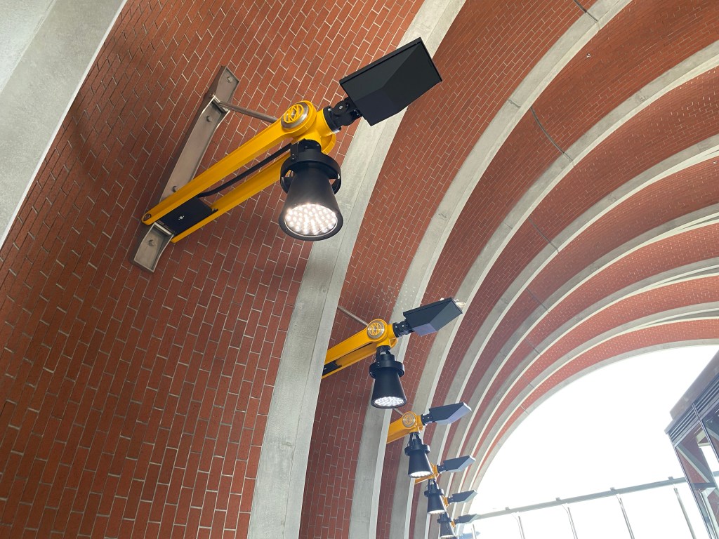
The yellow robotic lights from the lower levels are used here, seem a bit discordant, and there’s a lot of stainless steel and glass stuff too, but still it’s great. Out back you can see the top of the skylights, I think that’ll be more parkland.
The landscaping is all bit randomly made out of chunks, but there’s plenty to sit on. The main facade has a big artwork by Abdul Abdullah “Come Together,” obvious but nice.

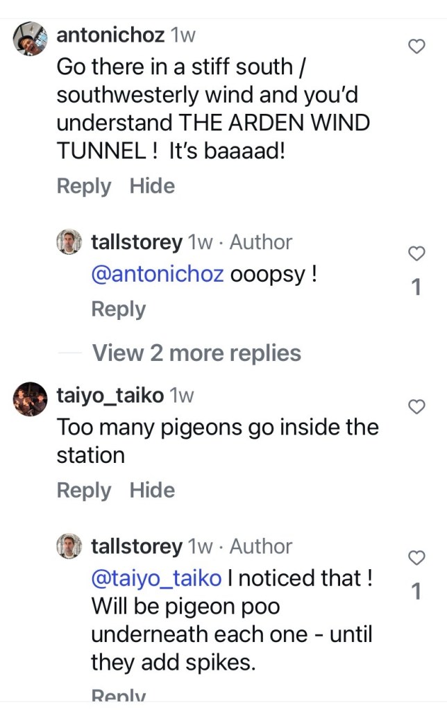

Got on a train through the Metro Tunnel yesterday, to Arden Station, where the below ground design is a bit different to Town Hall and State Library, but much like Parkville and Anzac. Lots of vast spaces, especially the impressive atriums linking the concourse with the platform, with a skylight above. Like the others it’s basically finely finished bare concrete, with services attached to the ceilings, and walls in panels of various materials. Overall pale or grey colours, so the yellow and orange bits really pop out. They’re all like I don’t know maybe robot/ engineering/ transformers themed ? all angles and struts, bits up and down, a bit mad actually. At platform level there’s a noughts & crosses idea ! And there’s various other things, smoke detectors ? also a bit robotic.
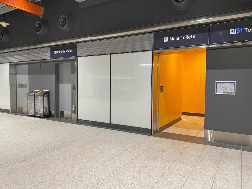
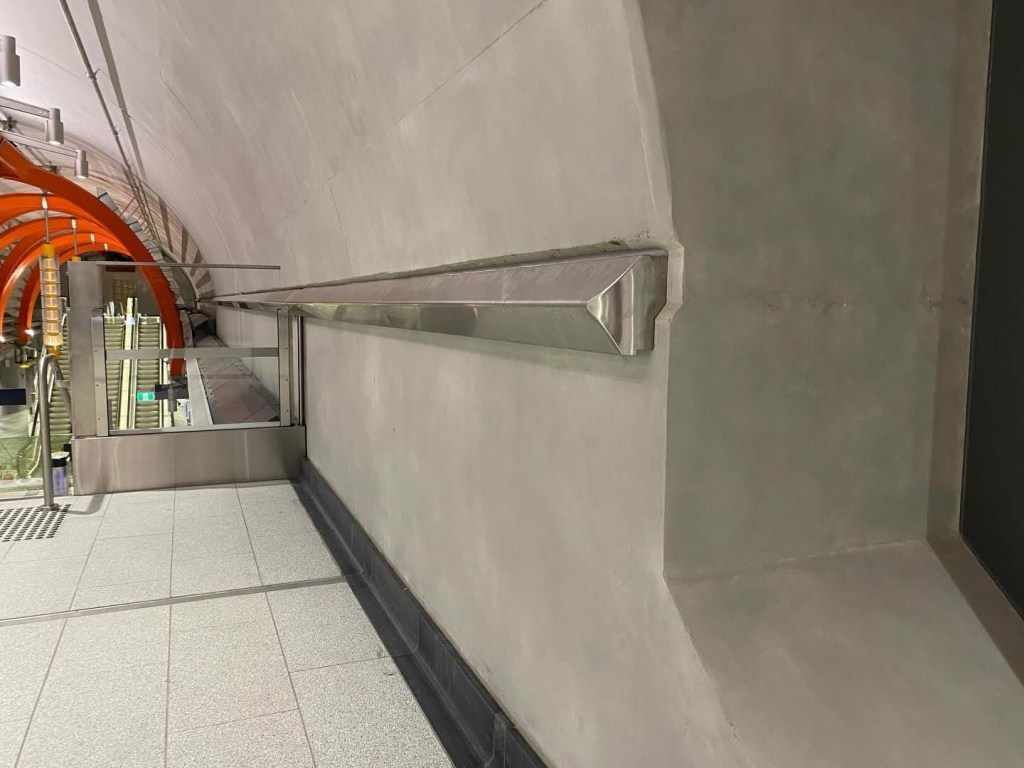
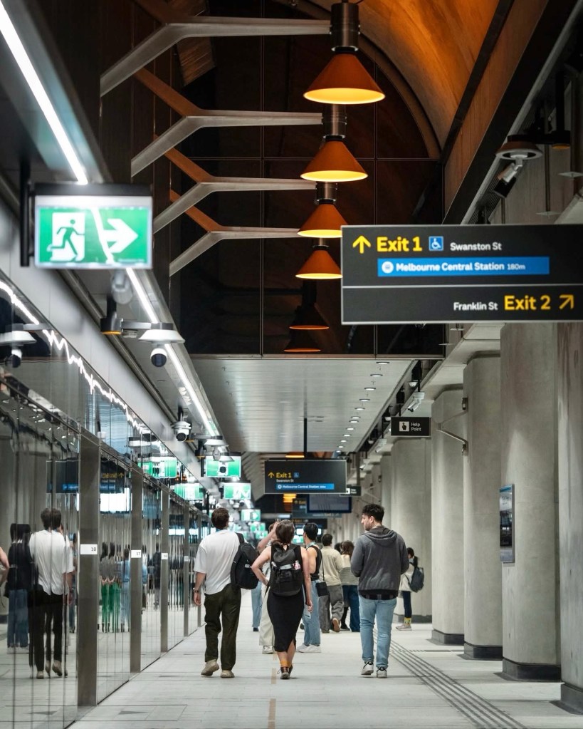
One of my neighbours worked on ‘wayfinding’ so I looked at the signage, standard sans-serif lettering, very legible, helped by large white or black backgrounds. And some with elaborate oversized brackets in stainless steel, rounded and angular, but a bit wasted since they’re not very visible. Interesting seats (though not many) and bins. There were quite a few advertising screens, but not large, but why have any at all I wonder, so distracting, and they feel like afterthoughts. The vast clean spaces contrast so much with the last pic, the underpass at Caulfield, which has character but maybe a bit too grungy.
I’ll also contrast ours with the Sydney Metro stations, where the design intent was the opposite, all smooth lines, hidden services, all wood, stone, white and bronze, all by different architects but similar feel. If I was in Sydney I’d probably be saying it was boringly contemporary, but …. it is pretty slick.


Perhaps when we get over the ooh and ahhh and the polies stop telling us how great it is we will get some objective architectural analysis, not aimed at you Rohan. I see as a utilitarian mish mash of unblended styles and techniques. The palate also could do with some work from an adult. Back to brutalism it seems, which leaves me cold.
LikeLike