6 March 2023:
St Paul’s Cathedral with towers as designed by English architect William Butterfield in 1877.
I could never understand why the 1920s spires didn’t match the rest, not even the stone. Just got a great little book on its history by the late (Bishop) James Grant, which clarifies a lot for me. First the stone – it’s Pyrmont sandstone, because the original Waurn Ponds wasn’t available, but … that stone starts off a pale colour then goes yellow, which they must have known? And when they decided to build the spires in the mid 1920s, Victorian Gothic was out of fashion, but to go off in a completely new and fussy new direction ? But that’s what they did, deciding in a competition to go with ‘correct’ 12thC Gothic. First image is from Alchetron, no date but with the cable cars must be 1880s, perhaps commissioned to show the church with the spires. Rest from the internet.


Butterfield was known for his creative forms and use of colour and pattern, but it seems this was a more conservative design of his.
He famously resigned from the job in a huff in 1884, since he felt the local architects Terry & Oakden were making too many decisions, but the only major changes they made was which exact stones to use, and the diagonal scoring on the blocks (which I always assumed was a Butterfield idea).
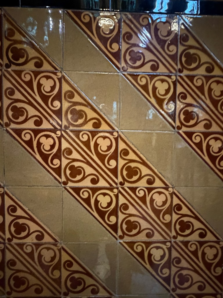
The interior is very much as Butterfield designed it, except he didn’t choose the fixtures or the floor or wall tiles, the latter thought of as too green and loud and discordant by the 1910s and nearly removed a number of times, but I think they’re fine.
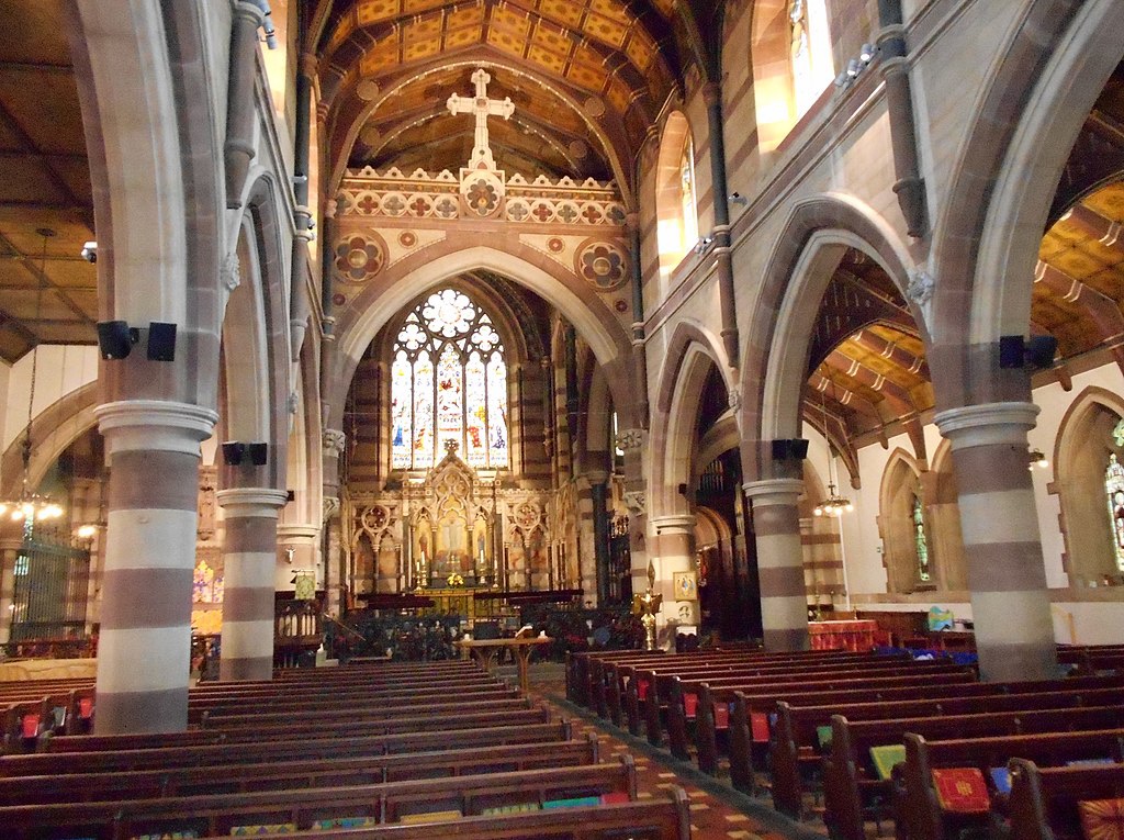
Someone has just pointed out to me that St Andrew’s Rugby, designed by William Butterfield in 1877, the same year as St Paul’s, has a stripy interior too ! It was finished in two years unlike St Paul’s, except the tower, completed to his design only 20 years later. The exterior is quite restrained. He left a medieval tower behind.


July 2026
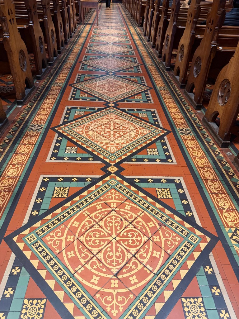
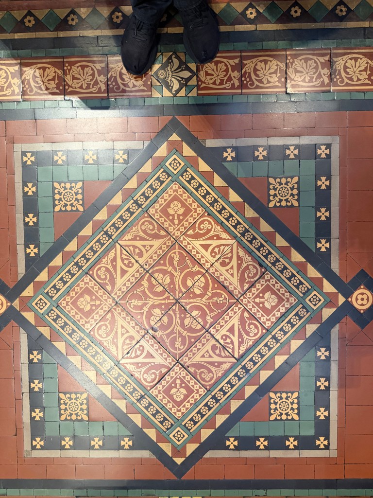
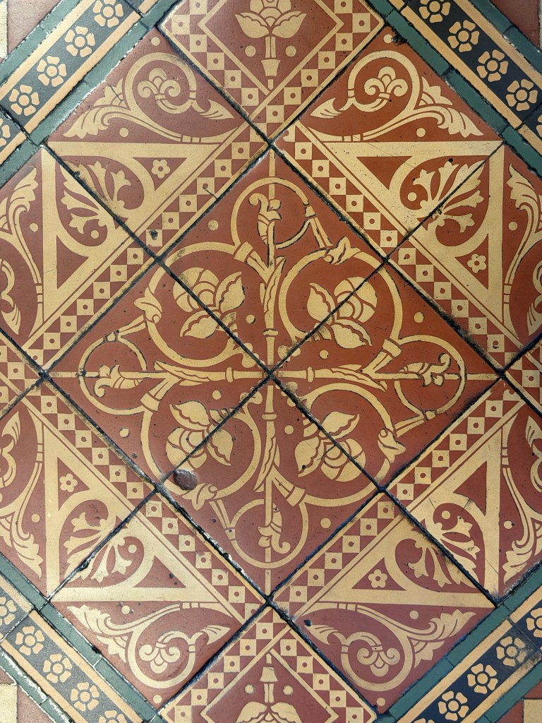
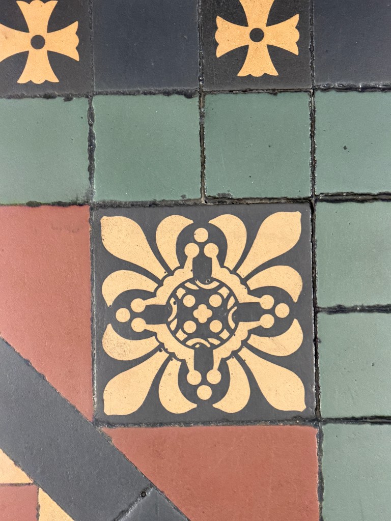
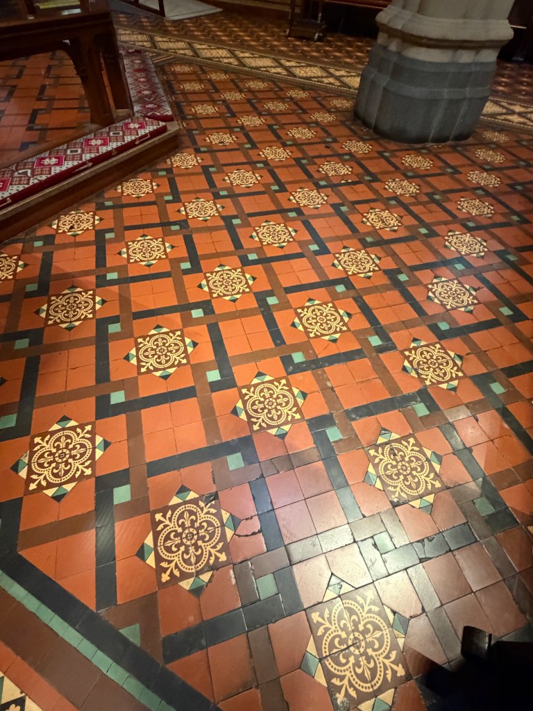
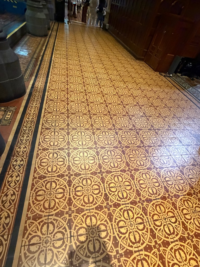
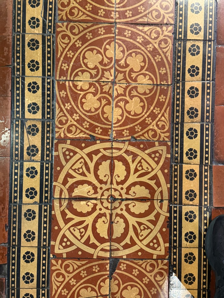
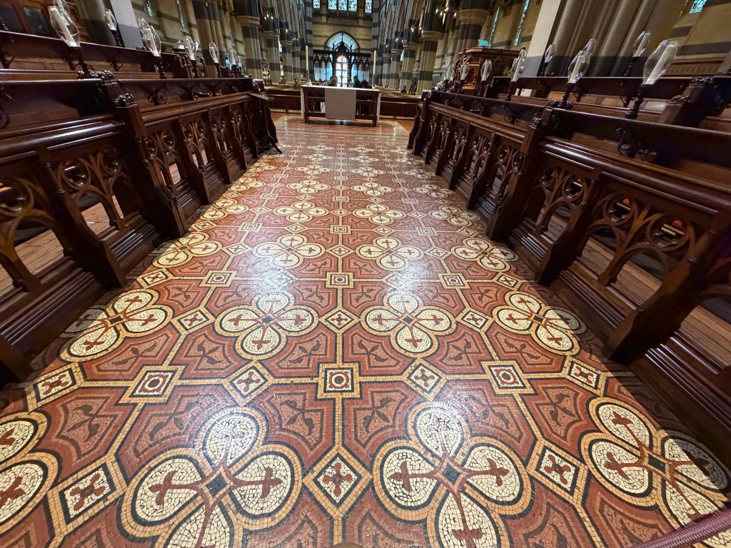
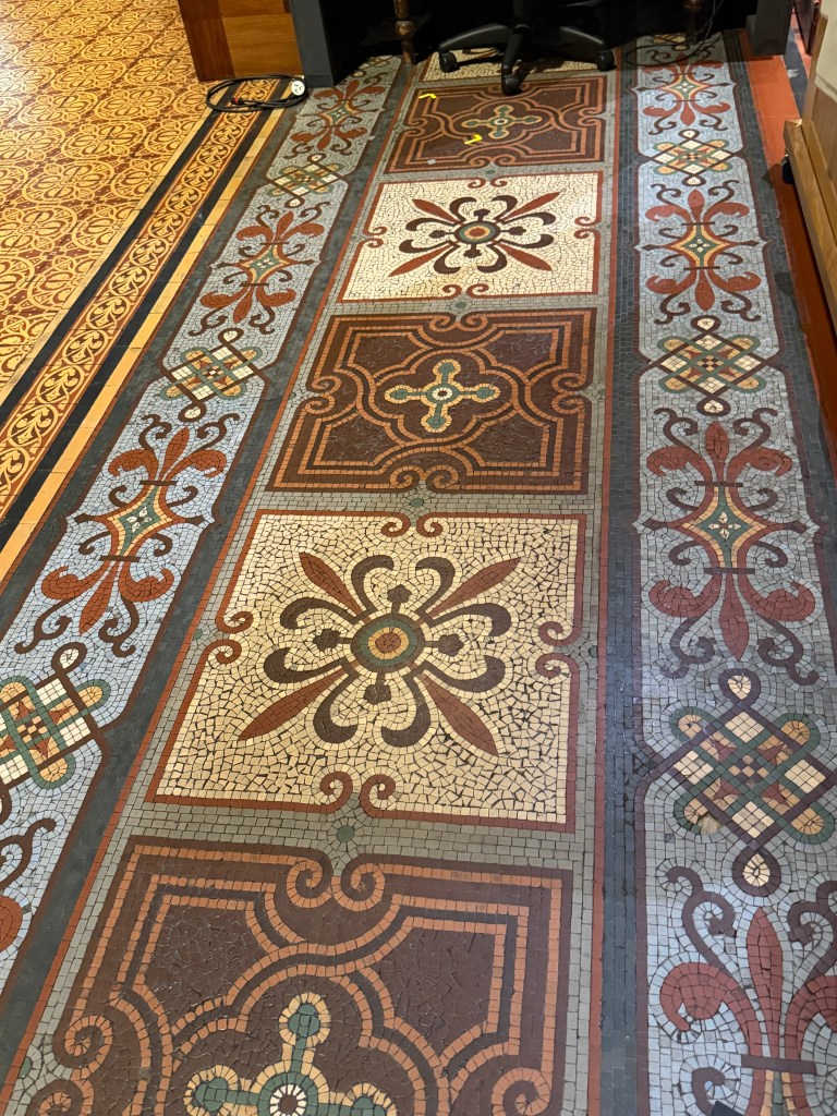
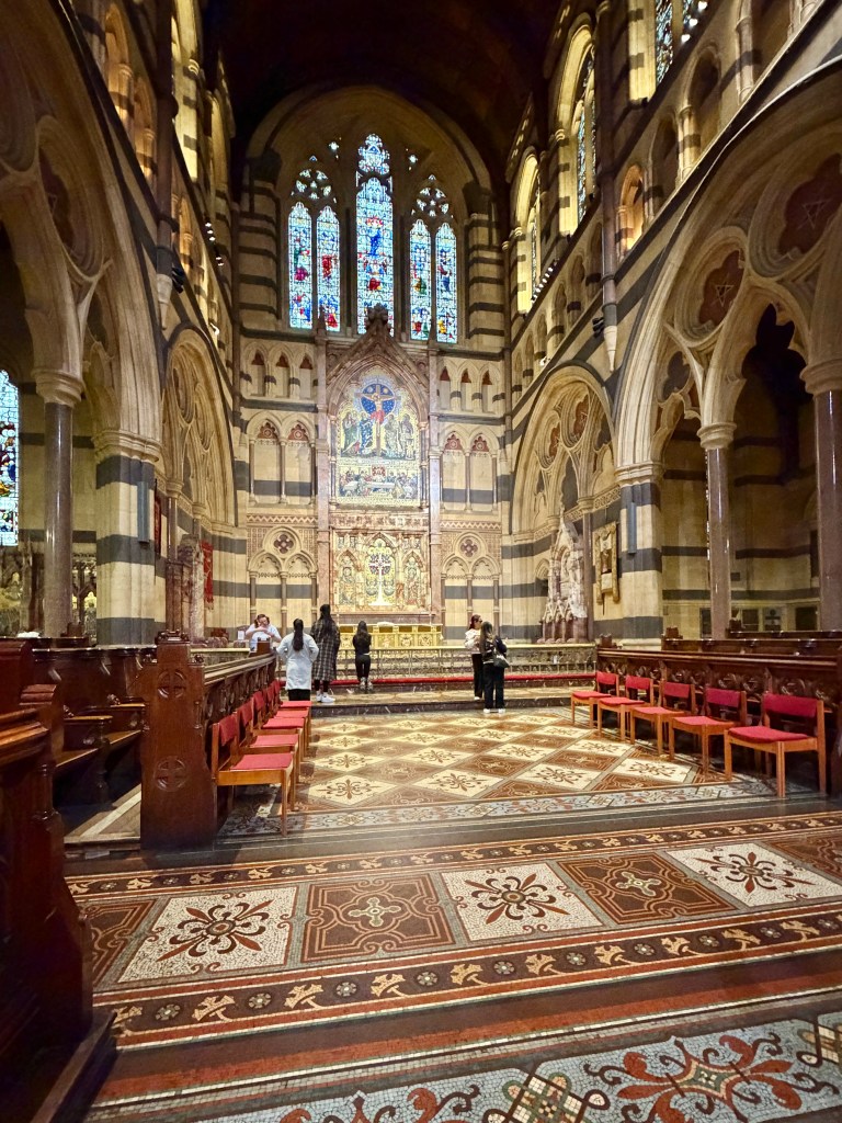
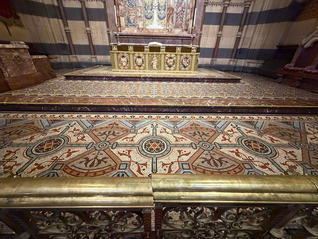
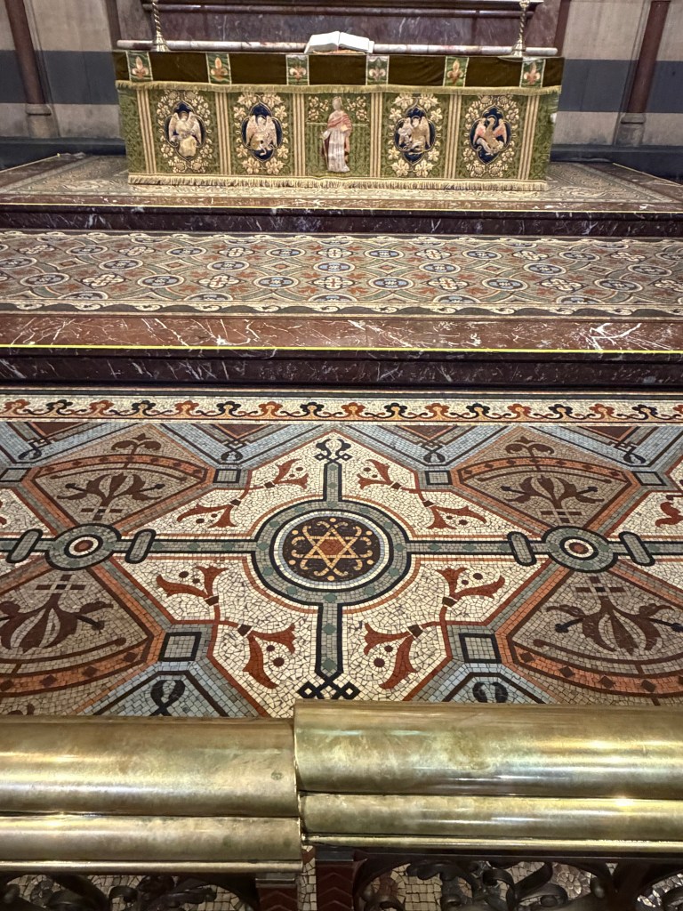
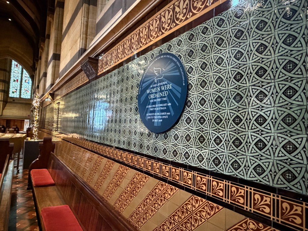
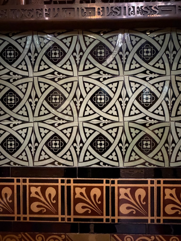
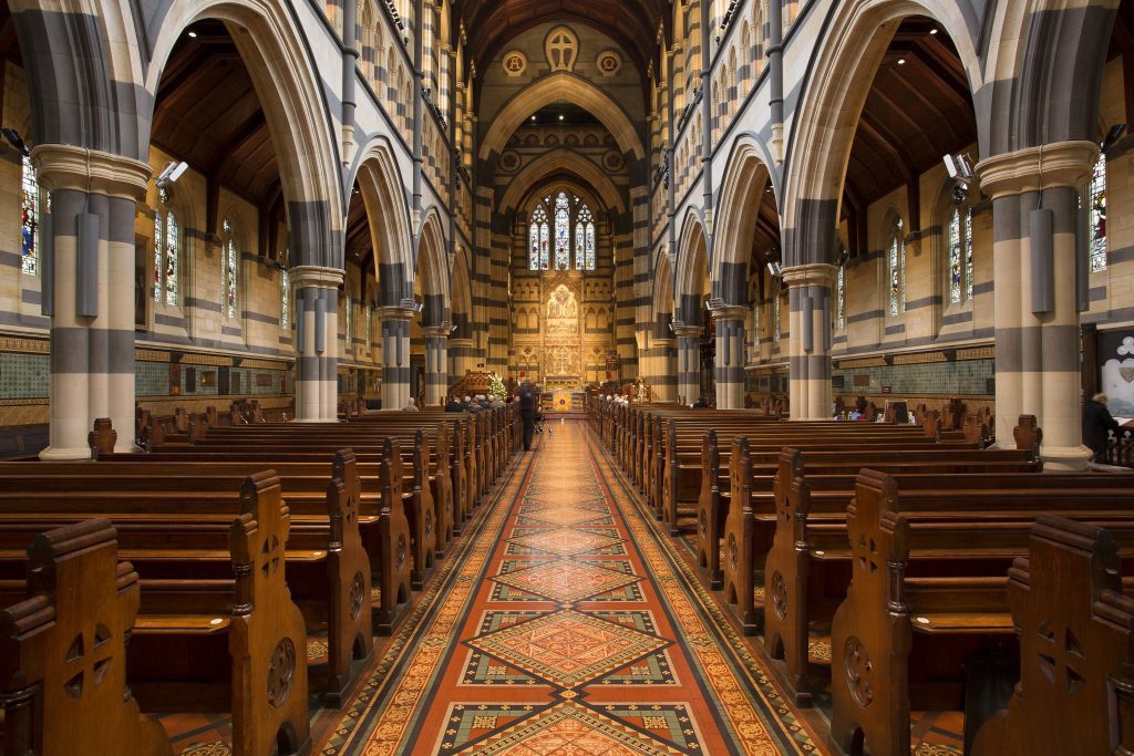
Popped into St Paul’s Cathedral the other day – my it’s big ! And striking, with those bold stripes. Designed by English architect William Butterfield, and built 1880-1891, the decoration is otherwise restrained, except for the floor and wall tiles, which is what I came to see. Wikipedia says they were supplied by British firm Maw & Co, a big manufacturer through the 19thC. It’s possible Butterfield didn’t choose them all, since he resigned in a huff in 1884 when only the front half was built; Reed & Barnes finished it off.
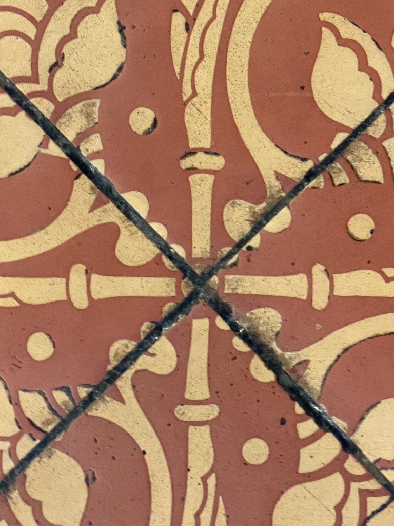
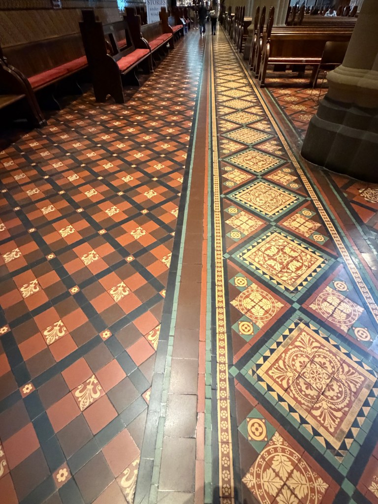
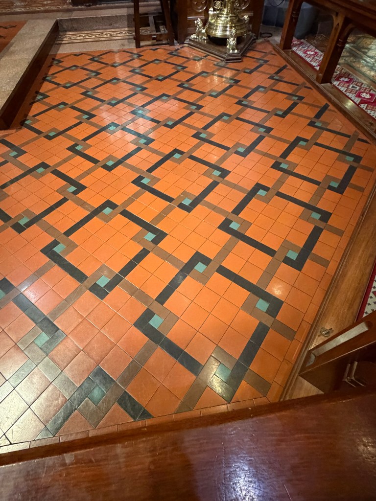
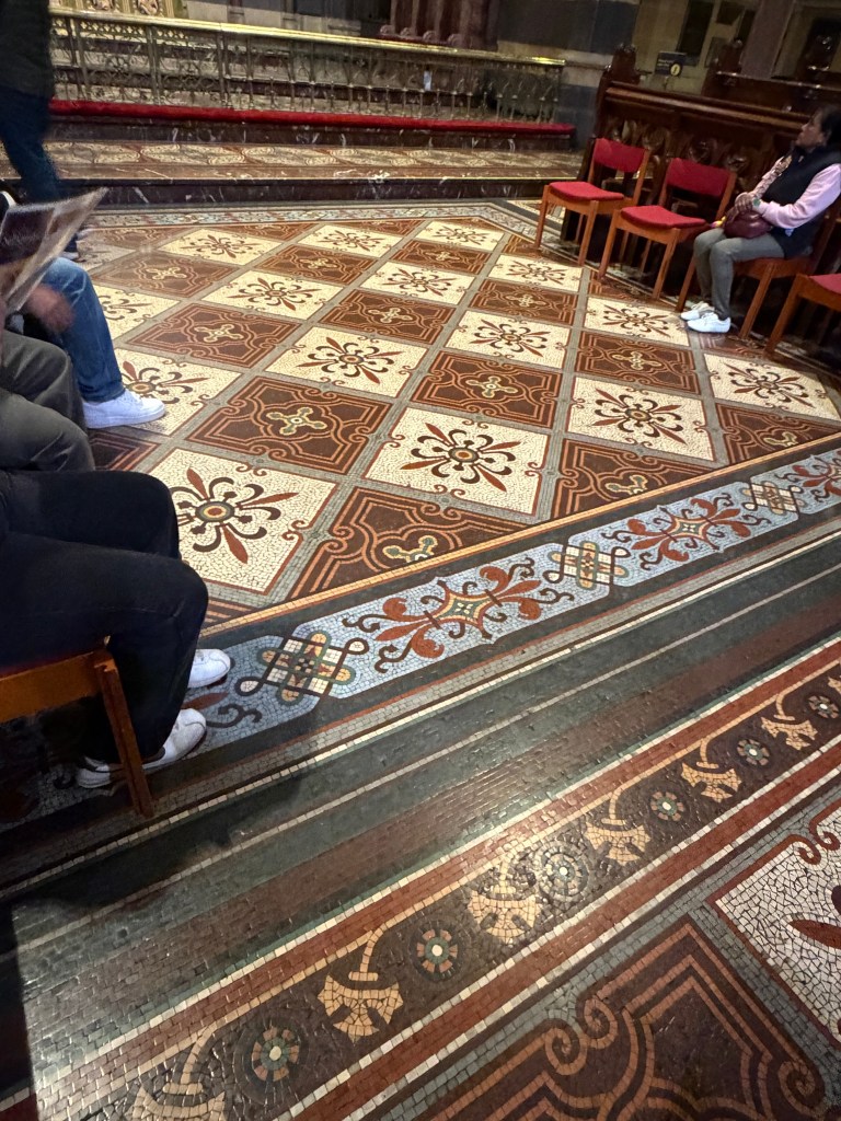
The whole floor is in encaustic tiles (colour goes all the way through) in various geometric patterns, all on the diagonal. They include tiles with elaborate patterns, mostly Gothic inspired, like fluer-de-lis, crosses, cloverleafs and stylised flowers, but the larger patterns go a bit classical floral. It’s more elaborate in the centre aisle and then changes patterns as you get to the sanctuary and chapels. Note that pic 7 is a new raised altar area in the crossing, which is tiled in a pattern matching the floor next to it, pic 6, but without the floral tiles. Looks rather modern.
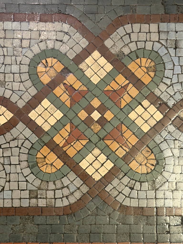
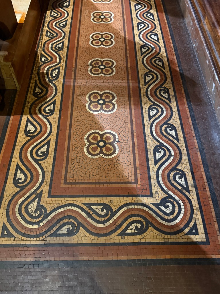
The choir and sanctuary are the most elaborate, in encaustic piece mosaic, with chequerboards, borders and, well, lots of stuff ! I think it’s rather beautiful.
The side walls have a high dado in enamelled tiles, with yet more Gothic patterns, including interlaced circles and diagonal bands. By the 1910s the green was thought discordant, and not what Butterfield would have chosen and almost removed. I think it’s fine, in fact amazing, and half covered by memorials anyway. I’m told in fact some decayed ones were replaced in the 70s, slightly darker, but you can hardly tell.